When I think of networks of any kind (social, knowledge, transportation,...) I think of a picture of nodes and connections. A tool that I like for generating network graphics is Gephi, https://gephi.org/.
You may ask, "how do I even pronounce that?" Gee-fee? Gef-fie? Jef-fee? It would be a fair question. The logo is the letter "G" and the Greek letter "Φ.". The software was developed in France. They pronounce the letter "g" much like English speakers pronounce the letter "j." The Greek letter is pronounced "fee" by Greeks. Mathematicians and American fraternities and sororities often pronounce it "fie." Good luck.
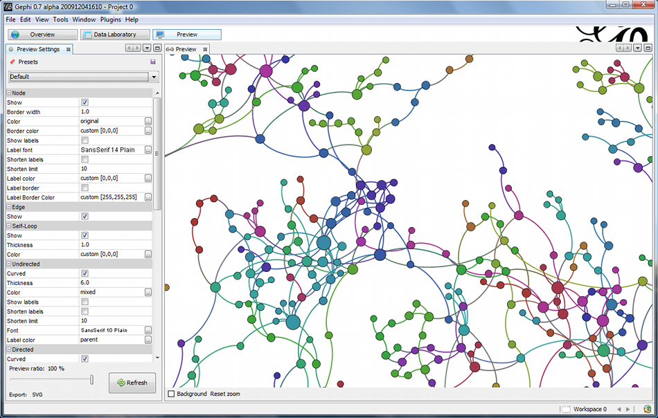
No matter what you call it, it is a handy tool for making network graphics. The important thing is to set your data up in a spreadsheet the way the software expects it to be set up. After that, be prepared to spend some time playing with all the visualization options. Some of the options are quite entertaining, as they make the nodes and connections wiggle around all over the screen. The website has a lot of tutorials available at https://gephi.org/users/ to help you learn to make graphics like this example from their website:
Somewhat related, here is a TedTalk by Gary Kovacs. https://www.ted.com/talks/gary_kovacs_tracking_our_online_trackers
ReplyDeleteThe graphic that is created looks similar to the one in your blog, but instead of networks, the graphic illustrates what websites are tracking your data. I also shared it to the class Diigo.
The internet and all the websites that comprise it is a huge network!
ReplyDelete